

| Knowledge Module Settings - User Interface Settings | Custom Dialog Control Creation | |
Depending on the deployment options available in your edition of Knowledge Builder, two Dialog Views maybe presented for each Dialog:
You can select which Layout View to default the Dialog Editor to be in, from the Deploy Settings (Target Media)
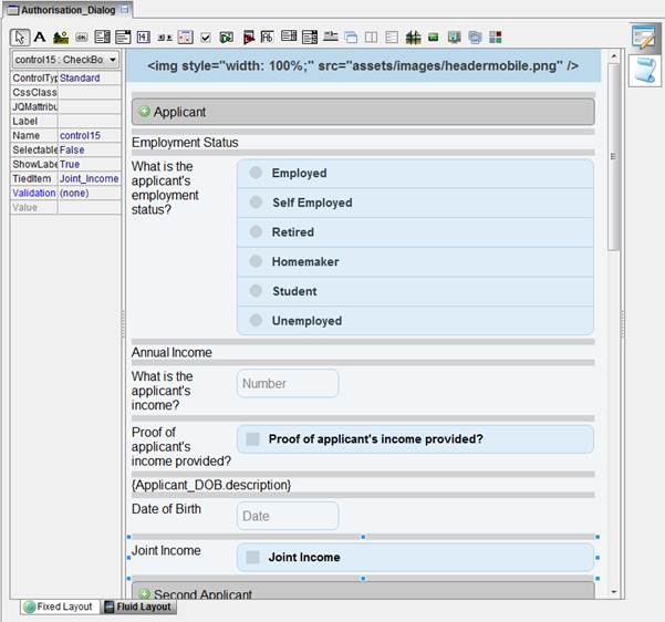
Fluid view Controls can be added to a Dialog using the usual drag & drop of Objects from the Explorer or by clicking the Control icon on the Dialog tool bar. Controls are stacked vertically which is best suited for small screen mobile devices such as Smart Phones. However designing a Dialog for a Tablet device (wider screen) typically allows for more control to be stacked horizontally by adding controls inside the "Column Section" control. Each Control has a "HasCaption" property which can display the text of the 'description' property of its tied object.
You can build the same Dialog content in both Fixed and Fluid views if you wish to deploy the same application for different Target Media. The "Deploy Settings" allows the deployment of different versions of the application for each "Target Media"